Recently I have been playing a lot with Tableau, and I decided to extract data from my Google Analytics Account in regard to one of my blogs and visualize the extracted data. Today I want to share my findings. Every visualization gives us some insights into the data. Data connection with Google Analytics opens pretty quick. You can select up 7 dimensions and 10 measures to work with.
The blog is about traveling, and it’s in Russian. Its main audience is in Russia, Eastern Europe, and United States. Below you can see number of sessions, pageviews, and new users by country and year quarter as well as a map.
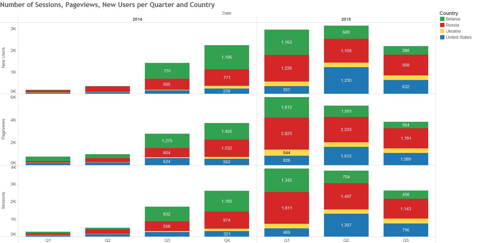
1
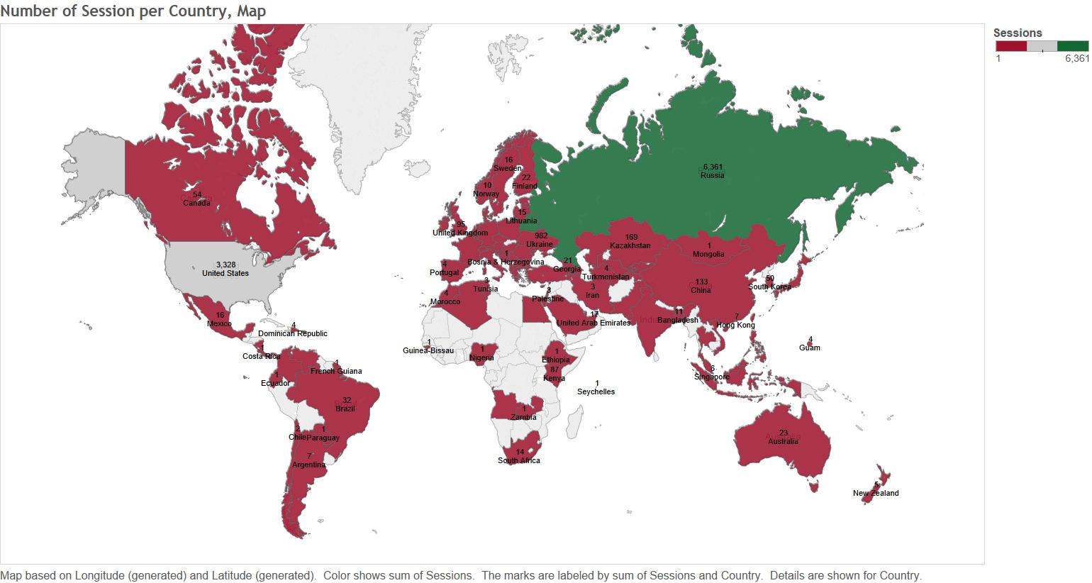
2
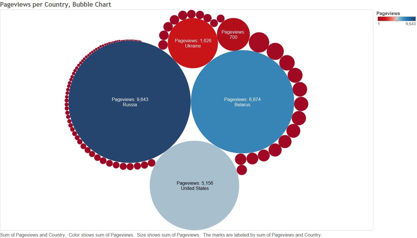
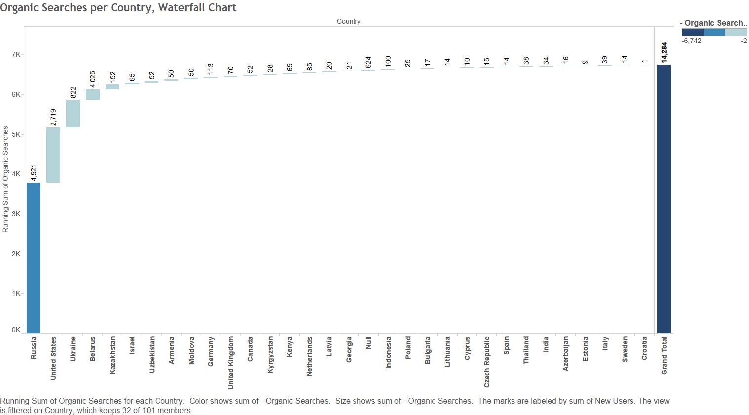
The bubble and waterfall charts below is basically showing the same information, but I like how they look 🙂 The waterfall chart shows the number of organic searches by country. We can see that although the U.S. is the third country by number of pageviews, it’s the second country by the number of organic searches. And Belarus where I am from is the second by number of pageviews, but the forth by the number of organic searches. I guess my friends and family from Belarus influenced this result.
3
4
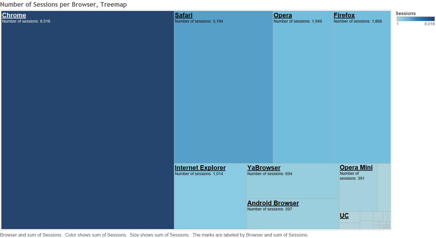
Not surprisingly, the most popular browser is Chrome.
5
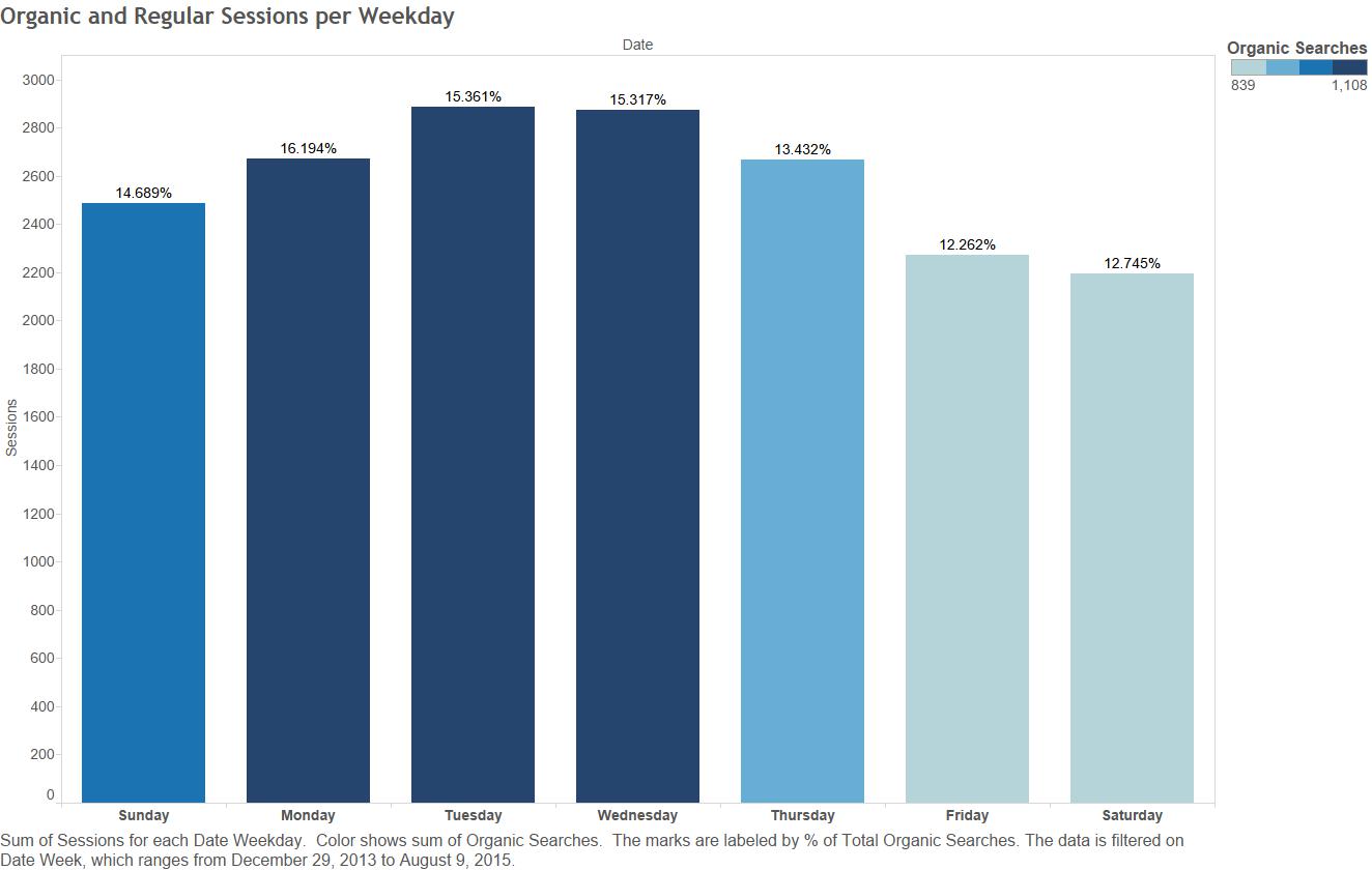
Although the blog has the greatest number of visitors on Tuesdays and Wednesdays, the week day when the greatest number/percent of visitors come to the blog via search engines is Monday.
6
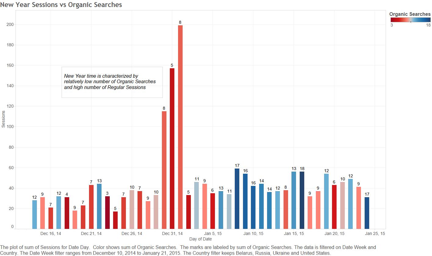
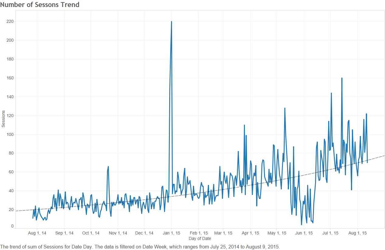
The picture 7 below shows New Year’s peak of number of sessions, however majority of 2014/2015 New Year’s users came to the site not via search engines since number of organic searches is relatively low. I think it happened because of my family, friends, and loyal readers’ availability of spare time during New Year days and hopefully because of their interest in the blog.
7
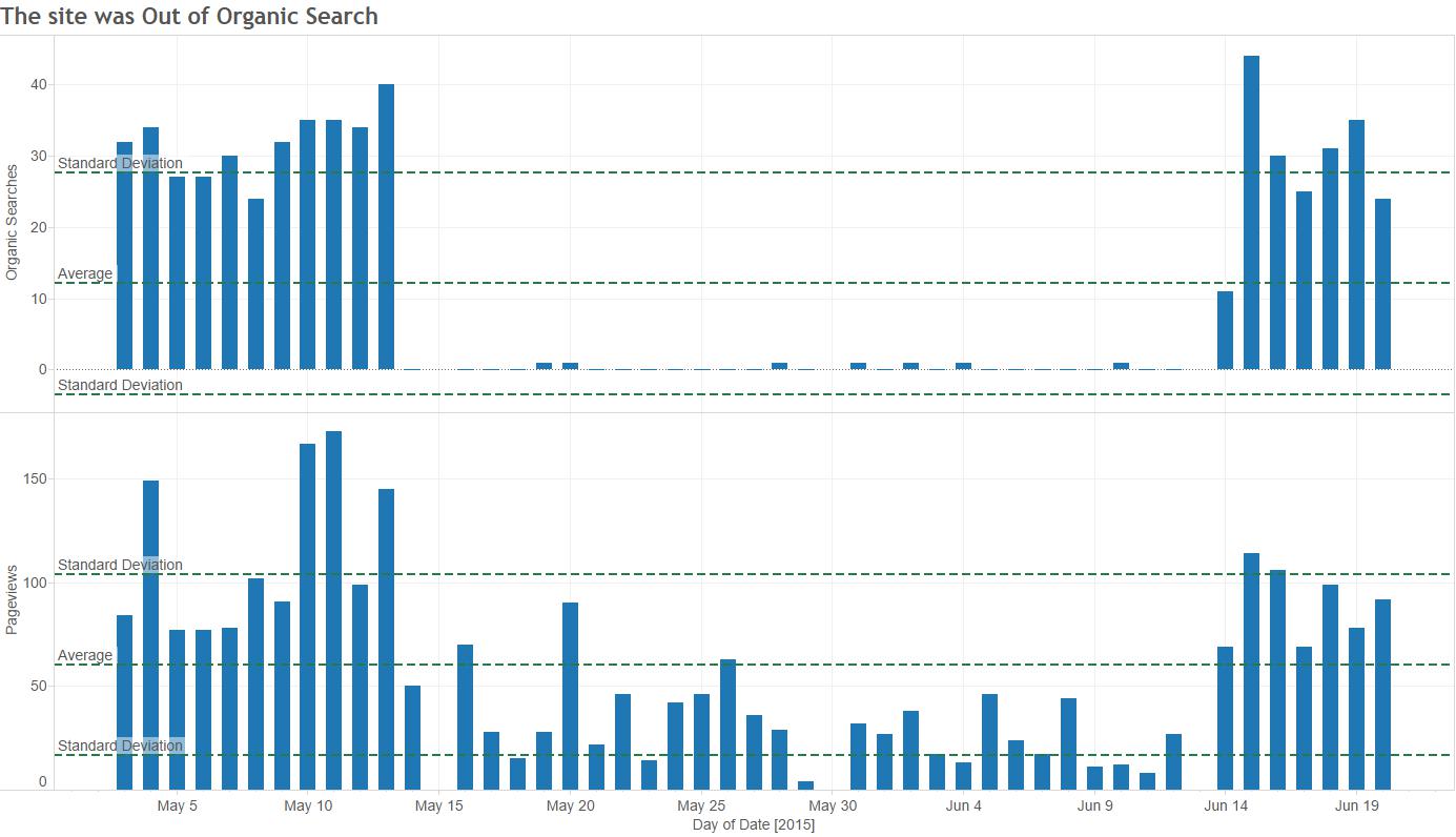
Number of Organic Searches dropped to zero between the middle of May and the middle of June. My first guess was that the Google Analytics tracking script was broken because I know for sure it happened recently, but I don’t remember when exactly. But if I add the number of Pageviews for the same timeframe, I can see that number of pageviews in not zero, and it’s happened not because of the broken tracking script. I think the blog was out of search for some reasons. I am going to look into it later.
8
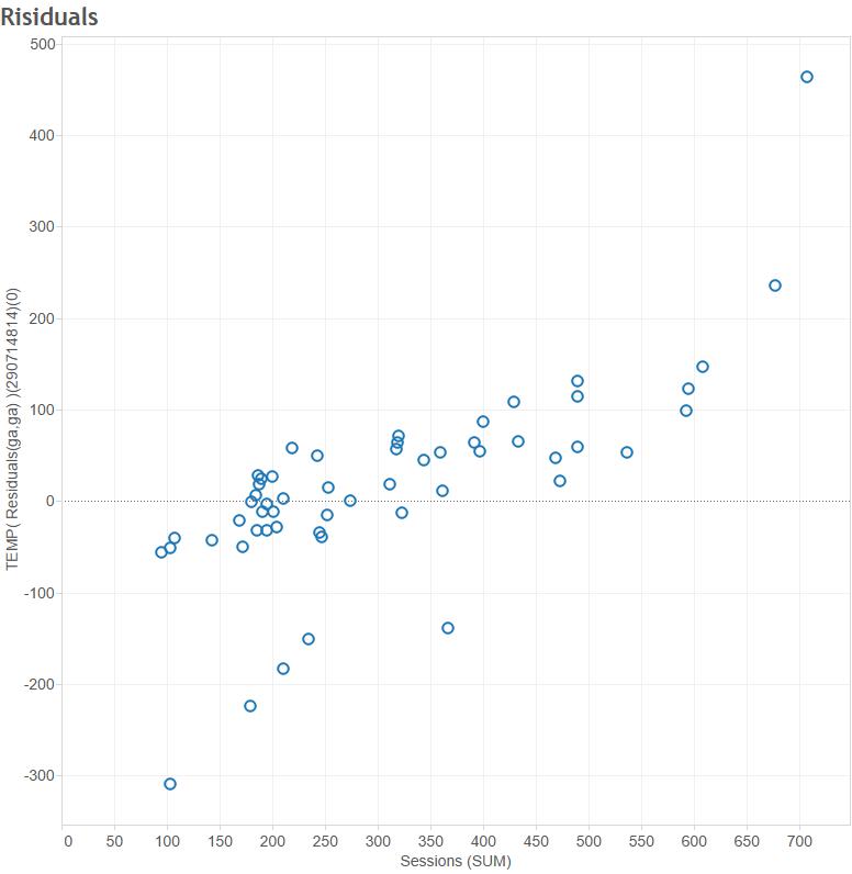
The next two pictures show the trend model for the Number of Sessions. However looking at the model’s residuals, I can say the model doesn’t do a good job in describing Number of Sessions. The residuals are heterogeneous, and the model is misspecified as a result. Although I got beautiful p-values, t-values, and F-value, I can’t trust them.
9
10
The picture 11 below shows the observations that fall within and outside 1.9 standard deviations of the mean value. The red-dotted observations represent outliers. What is the reason of these outliers? One of the explanations I came up with is that I may have posted a new article on or before those days, and the other one is spamming activities.

11
The picture 12 says that almost 70% of visitors view only one page, and 15% view two pages. It’s not a good result at all. I have to increase the number of pageviews by using more interlinks, show more related posts, split up longer posts into two or more posts, etc.

12
So I got a lot of informations to think about how to improve my blog’s performance.
Working with Tableau was easy, quick, and interesting. Tableau has very powerful visualisation tools. I really enjoyed working with Tableau.